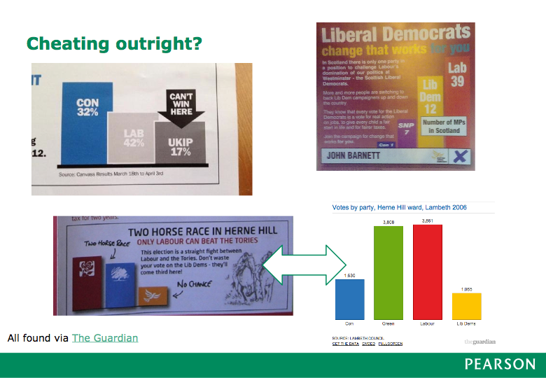
I recently gave a talk at the Big Data Innovation Summit called Lies, Damned Lies & Dataviz: Bad visualization, and how to avoid it. The aim: educate and entertain. I’m not above resorting to mockery when a graphic is particularly incompetent or manipulative, and I’ve never had that many laughs from a conference crowd before.
Pearson Labs asked to write up a short blog post version which is here — enjoy. And if you liked that, I’ll be revisiting the same subject at a Skills Matter event in November.
Category: news
Tags: visualization, events
No comments? I'm no longer sure blog comments are relevant. I'd rather you replied on Twitter, or wrote a response on your own blog or a site like Medium.
All content (cc) Andrew Clegg, under Creative Commons Attribution-ShareAlike 4.0 License. Built on Pelican & Python. Theme based on svbhack by Giulio Fidente.
